MultiBank.io
MultiBank.io
A crypto exchange home you can make your own, plus a referral flow people finish.

- Brand
- MultiBank.io
- Platform
- iOS · Android
- My role
- Lead Product Designer
- Year
- 2025
The context. Who it’s for and what had to change.
About the brand
MultiBank.io is MultiBank Group’s regulated crypto exchange, offering spot and futures trading, staking and the MBG token. Its users range from first-time buyers to active traders who check prices dozens of times a day.
The user problem
Everyone opens the app for something different: a balance check, a quick trade, staking yields. A fixed home screen can’t serve them all. Referrals have four steps between sign-up and reward, and every step is a chance for an invited friend to drop off.
The business goal
Raise daily engagement and grow through referrals, with all new work built from Design System V2 components so it ships fast and stays consistent.
Features I designed. The need, the flow, the pixels.

Feature 01
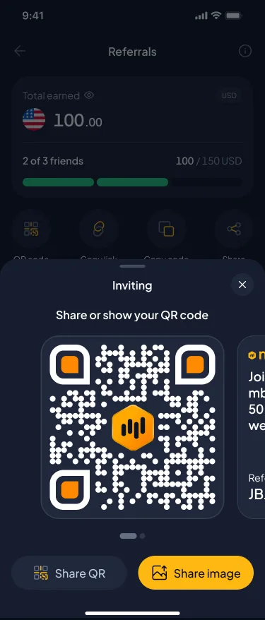
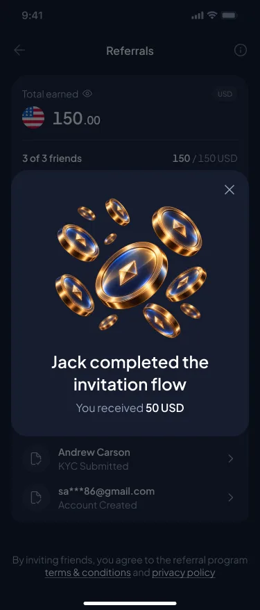
Featured flow: Referrals V2
Referrers want to know what they’ve earned, who is stuck and how to nudge them. Invitees need a clear path to the reward.
UX decision
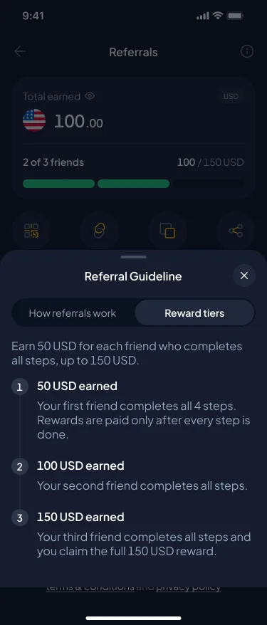
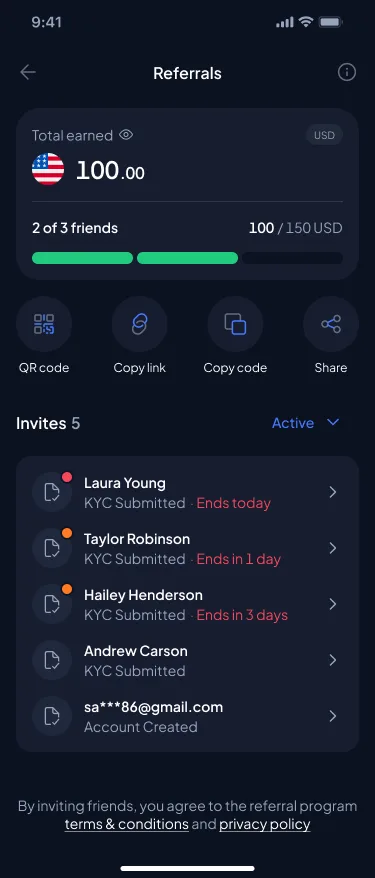
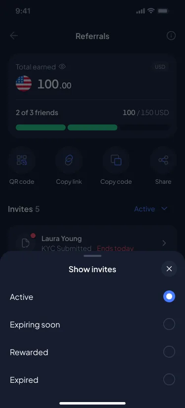
I mapped the whole lifecycle across ~20 screens: first entry and onboarding, the earnings dashboard, sharing (QR, invite image, link, code), invite filtering (Active, Expiring soon, Rewarded, Expired), per-invitee step tracking and a reward guideline. Urgency (“Ends today”, “Ends in 1 day”) is surfaced on the list so referrers act before an invite expires.
UI decision
The earnings card pairs the total with a segmented progress bar (2 of 3 friends · 100/150 USD). Status dots show urgency on each row. A privacy toggle masks the amount, and every sheet and toast comes from DS V2 molecules.
Feature 02
Invitee tracking and nudges
Referrers need to see exactly where each friend is stuck and do something about it.
UX decision
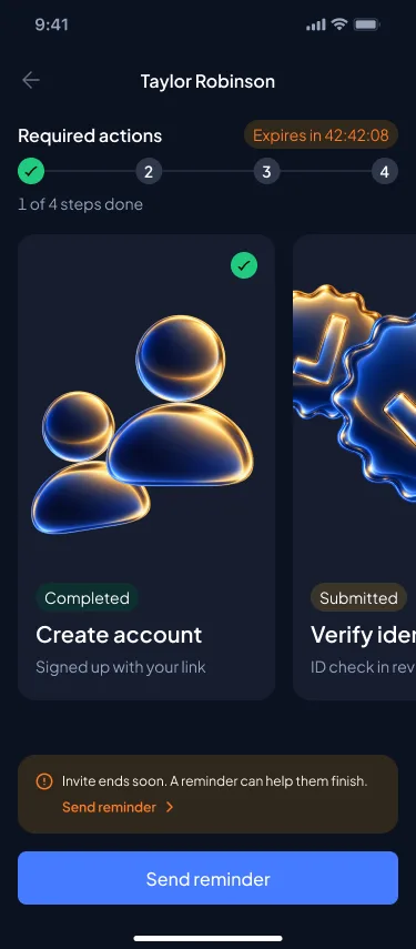
Each invite opens a detail view with the four required steps (Create account, Verify identity, Deposit funds, Make first trade), a live countdown and one primary action: Send reminder. A filter sheet narrows the list by status.
UI decision
Steps appear as a horizontally swipeable card carousel with a stepper above it. Completed and pending states use the same card with a status label, so progress reads at a glance.
Feature 03
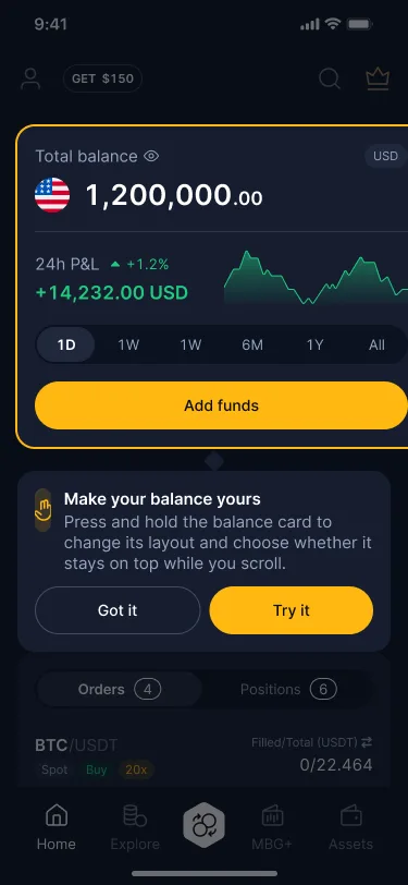
A customisable home
Put the things I care about first, and hide the rest.
UX decision
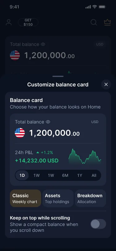
“Customize your experience” lets people choose a balance card style (Classic, Assets, Breakdown), keep it pinned while scrolling, and turn on and reorder up to five widgets: Recurring buy, Referrals, VIP, Markets and Earn. A coach mark teaches the long-press shortcut in context.
UI decision
The sheet previews each widget live, so people pick by sight rather than by name. Reordering works by drag or by arrow buttons for accessibility, and toggles sit on the right edge for one-handed use.
Feature 04
Explore: market mood before market lists
Newer investors want to know “how’s the market today?” before scrolling a ticker list.
UX decision
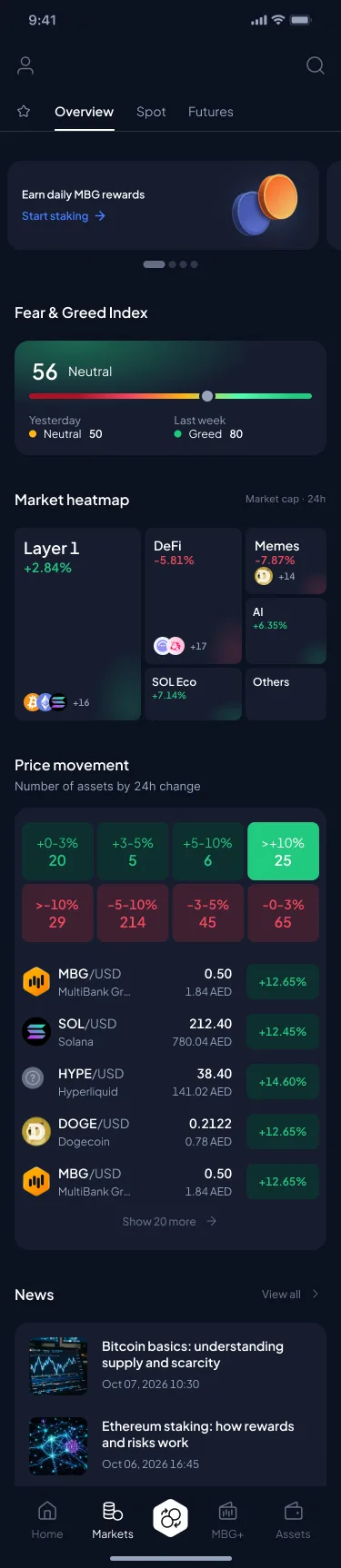
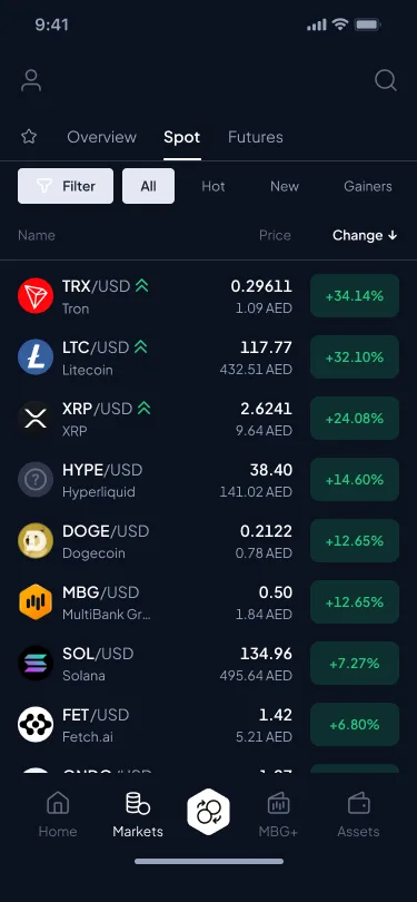
The Overview tab leads with the Fear & Greed index, a sector heatmap and a price-movement histogram, then gainers and news. The Spot tab keeps the fast filterable list (All, Hot, New, Gainers) for active traders.
UI decision
The histogram buckets are tappable tiles in green and red. The heatmap sizes sectors by market cap and shows token avatars inside each block.
Design system. The visual language underneath.
Everything here is built from Design System V2: a dark navy foundation with semantic tokens and molecule-level components (Legal note, Detail footer, QR sheet, Filter sheet) designed to be reused across flows.
Typography. Plus Jakarta Sans. H2 24/32 for balances, H5 16/20 for card titles, Body 2 14/18 for rows and XS 10/13 for meta.
Colour tokens
- surface/background-default#0B1120
- surface/card-base#161D2F
- icon/brand#467BFF
- text/body-green#21CB80
- text/body-red#F5475D
- text/body-orange#FF7A24
Radius scale of 8 / 16 / 24 / full, so card, sheet and pill read as one family.
Status uses colour and words together (“Ends today”), so it never depends on colour alone.
Every flow was assembled from DS-only components before any one-off was allowed.
Outcome. What changed.
Referral completion (invite → first trade) up 32% from V1 to V2.
41% of active users customised their home in the first 30 days.
Referrers sent 2.3 reminders on average, and 38% of nudged invites went on to finish.